
Is your PowerPoint really ready for green screen?
A PowerPoint presentation that looks perfect on your laptop can become difficult to follow during a green screen production. Discover how to design slides that account for the presenter, the visual composition and the viewing experience.
A presentation can look perfect on your computer screen and become surprisingly difficult to read during a green screen production. Not because the technology fails, but because the slides were designed without considering the person who will appear in front of them. A successful green screen presentation therefore begins long before filming: with the design of the slides themselves.
The presenter becomes part of the presentation
In a traditional PowerPoint presentation, slides are projected onto a screen behind or beside the speaker. The presenter and the presentation each occupy their own space.
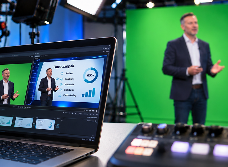
Green screen production works differently. The presenter stands in front of a green background, which is digitally replaced during filming, live broadcasting or post-production. The replacement might be a photograph, an animation, a virtual studio or a PowerPoint presentation. The result is a single composite image in which the presenter and the presentation appear together. And that's precisely where a problem often overlooked during preparation begins.
PowerPoint presentations are generally designed to fill the entire screen. Titles, charts, images and text blocks are distributed across the available space. But once a presenter is added to the image, part of that space disappears. The person is literally standing in front of the presentation.
The most common mistake: using every inch of the screen
Imagine a slide with a title at the top, three columns of text and a chart on the right. On a laptop screen, everything looks well organised. During the green screen production, the presenter is positioned on the left. Suddenly, the first column of text and part of the title disappear behind their body. The production team can try making the presenter smaller or moving them elsewhere in the frame. But that isn't always the best solution. When the presenter becomes too small, one of the main advantages of green screen is lost: the direct, personal presence of someone explaining the information.
The problem isn't necessarily that the presenter is standing in the wrong place. It's that the presentation was never designed to share the screen with a person.
Designing slides for green screen isn't about filling the entire screen. It's about creating a composition that also makes room for a human being.
Make room for the presenter
A simple solution is to define an area in advance where the presenter will appear.
In a 16:9 presentation, for example, approximately one-third of the screen width can be reserved on the left or right. The essential content is then placed within the remaining space. That doesn't mean the reserved area needs to be completely empty or white. Background colours, graphic elements and the overall visual identity can continue across it. What matters is that no essential text, figures or charts are placed where the presenter will stand. This creates a coherent visual composition in which the presenter fits naturally without obscuring important information.
The exact proportions depend on the production. A presenter shown from the waist up will occupy more space than someone appearing only in a head-and-shoulders shot. Camera framing and the intended visual composition also play a role. That's why the presenter's position should ideally be agreed upon before the slides are finalised.
 |  |
Should you use a 4:3 PowerPoint format instead?
Another option is to design the presentation in a narrower format, such as 4:3, and leave additional space beside it for the presenter. This can work well when the production setup has been designed accordingly. However, that doesn't mean 4:3 is automatically better for green screen. A 16:9 presentation can work just as effectively, provided its content is arranged around the space actually available.
The most important consideration isn't the aspect ratio of the original PowerPoint file, but how the slides and presenter will ultimately appear together in the finished video. That final composition should guide the design from the beginning.
Remember that viewers may be watching on smaller screens
There's another challenge worth considering. When the presenter occupies part of the image, less space remains for the slides. A presentation that's perfectly readable on a large computer monitor can become considerably harder to follow during a broadcast. This is particularly relevant when viewers watch a webinar on a laptop, tablet or smartphone. Small fonts, detailed tables and complex charts can quickly become problematic. It's therefore worth taking a critical look at the content of each slide.
Does every piece of information need to be visible at the same time? Could a complex chart be introduced in stages? Is it necessary to display an entire table, or would highlighting a few key figures communicate the message more clearly? Sometimes, replacing one complicated slide with three simpler slides, each focused on a single message, is the better choice. This doesn't just make the presentation more suitable for green screen. It also helps viewers understand and follow the information more easily.
A good background should support the presenter
Green screen productions often place considerable emphasis on the technical quality of the background. The resolution needs to be sufficient, colours should be reproduced accurately, and the combination of foreground and background should look natural. But the visual complexity of the background deserves attention too. A background filled with detail, strong contrasts or constantly moving elements can distract from the presenter.
The same applies to PowerPoint slides. When a slide already contains large amounts of text, charts and illustrations, adding a person makes the image even more complex. A clear, carefully considered layout helps direct attention towards what matters. That doesn't mean every presentation needs to be minimalist. It means every visual element should serve a purpose.
The background should support the presenter rather than constantly compete for the viewer's attention.
What if the presenter changes position during the presentation?
Keeping the presenter in a fixed position makes slide design considerably easier. But some productions call for greater variety. The production team may want to alternate between wide shots and close-ups. The presenter might appear on the left in one shot and on the right in another. Or a chart might temporarily fill the entire screen. These decisions affect how the presentation should be designed.
If the presenter moves from left to right, a text-free area on only one side may no longer be sufficient. Similarly, when different camera framings are used, the virtual background must accommodate those compositions. It's therefore important to decide in advance which shots and layouts will be used during the broadcast.
Not every slide necessarily needs to work in every configuration. When explaining a complex chart, it may be much clearer to switch temporarily to a full-screen presentation without the speaker. That's an editorial decision too.
The question isn't how to keep the presenter on screen at all times, but when their presence genuinely adds value to the message.
Test the presentation as viewers will actually see it
Checking a PowerPoint presentation on your own laptop isn't enough. The most important test is the composite image: the presentation with the presenter in front of it. Only then can you properly assess whether titles remain visible, charts are readable and the chosen composition works.
A short technical rehearsal can prevent many problems. Don't just check the opening slide. Pay particular attention to slides containing the most information, the smallest text or the most complicated charts. It's also worth reviewing the result on a smaller screen.
A presentation that looks perfectly readable on a large studio monitor may offer a very different experience to someone watching at home on a laptop. The purpose of this test isn't simply to identify technical problems. Above all, it's to make sure viewers can follow the information without unnecessary effort.
Design for the final image, not the PowerPoint file
Green screen production offers exciting possibilities for making presentations more engaging and visually dynamic. The presenter can appear within the content itself, charts can be displayed beside them, and different visual compositions can alternate throughout the production. But those possibilities only work when the presentation has been designed with them in mind.
Discovering on the day of filming that the presenter is covering important information means improvising with a layout that's already been finalised. Planning for the finished image from the outset provides far greater flexibility.
The most important question when designing PowerPoint slides for green screen isn': “What does my slide look like?” It's: “What will my slide look like when the presenter is in the picture?”